Fene, Paisaje de Maniños: Vintage Travel Poster from a 1932 Postcard
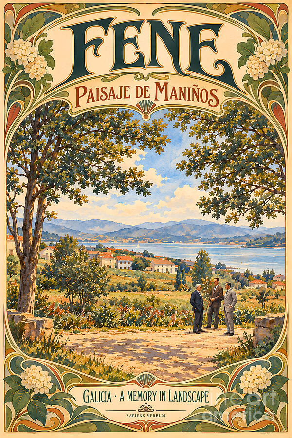
Huge letters spell out FENE across the top, in a deep bottle green with curling Art Nouveau serifs. Below them, in red capitals, comes Paisaje de Maniños, and then the view opens through an arch of leaves: two trees framing a sunlit road, three men in suits talking in the middle of it, white houses with red roofs on the slope and the Ría de Ferrol stretching away to a line of blue hills, with a single white sail on the water. Clusters of white hydrangeas bloom in the four corners, scallop shells sit at the top and bottom of the frame, and a ribbon at the foot reads Galicia · A Memory in Landscape. This is the first of a new Sapiens Verbum series of vintage travel posters made from old photographs, and it starts where our Ferrolterra postcards left off: with the same 1932 view of Maniños, recast as the poster it never had.
🖼️ Get this poster as a print →
Original photograph: Photographer not named, 1932 (postcard printed by Heliotipia Artística Española, Madrid)
Interpretation: Sapiens Verbum
Subject: A general view of the parish of Maniños with the ría in the background and three men posing on the road
Location: Maniños, Fene, A Coruña, Galicia, Spain, on the southern shore of the Ría de Ferrol
Medium: Art Nouveau travel-poster interpretation of a public-domain postcard photograph
Lettering: FENE · Paisaje de Maniños · Galicia · A Memory in Landscape · Sapiens Verbum
Series: Vintage Travel Posters from Old Photographs; Ferrolterra
The scene inside the frame is the one in the watercolour: the slender trunk on the left, the heavy branch reaching in from the right, the dusty road, the three men, one older and grey-haired with a walking stick, the houses on the hill and the calm water beyond. What changes is everything around it. The view sits in a tall arch, like a stage seen through a proscenium, and the border does the work that a poster has to do from across a street: it catches the eye with colour and pattern, then leads it down into the picture. The palette is the warm, slightly faded one of old colour lithographs, cream paper, sage green, rust and gold, and the lettering is designed to be read from a distance before the details are seen up close.
The golden age of the travel poster
The illustrated poster as we know it was born in Paris. Jules Chéret began producing colour lithographic posters there in 1866, which is why he is often called the father of the poster; in 1889 he designed the one announcing the opening of the Moulin Rouge (Xosé Santos Solla, Os inicios do cartelismo turístico en Galicia). Within a few years painters of the stature of Toulouse-Lautrec were designing posters too, and the hoardings of the city became an open-air gallery.
The decisive moment for the style of this poster came at the very end of 1894. As the story is told, a Czech illustrator then little known in Paris, Alphonse Mucha, was asked at short notice to design a poster for Sarah Bernhardt’s production of Gismonda. His tall, narrow design, with its pastel colours and near life-size figure, was on the walls of Paris on 1 January 1895 and, in the words of the Mucha Foundation, it revolutionised poster design. Collectors bribed bill-stickers or went out at night to cut the posters down from the walls, and Bernhardt was so pleased that she reused the design for her American tour of 1896 (Victoria and Albert Museum).
Mucha went on to design for railway companies as well as for theatres, perfumes and champagne. His 1897 poster Monaco · Monte-Carlo for the P.L.M. railway, which sold holidays on the Mediterranean coast, places a pale female figure against a blue sea and a mountainous shore, wrapped in a pattern of curving stems of lilac, hydrangea, dianthus and violet, with the towers of the Monte Carlo casino in the distance (Mucha Foundation). The recipe is the one this poster borrows: a real landscape, a frame of stylised flowers, and lettering that turns a place name into an invitation.
Galicia on the poster
Galicia came late to the travel poster, as it came late to the railway. One of the earliest examples, from 1900, was a poster for the Northern Railway of Spain advertising cheap pleasure trips and fast trains to the beaches and spas of the north; in its corner for Galicia, A Coruña is represented by a peasant woman with her cows, with only the sailing ships in the background hinting at a holiday by the sea. The early tourist images of Galicia were mostly spas such as Mondariz, and in 1909 the Exposición Regional Gallega in Santiago, held in a Holy Year, drew some 140,000 visitors, a figure no Holy Year would match again until 1943 (Santos Solla).
Spain created a National Tourism Commission in 1905 and a Royal Commissariat for Tourism in 1911, but the history of the Spanish tourist poster really begins with the Patronato Nacional de Turismo, created in 1928, whose first campaign used the poster as its main medium (Instituto Cervantes, Museo Virtual de Arte Publicitario; Patronato Nacional de Turismo). For Galicia, the best-known result is Federico Ribas’s Rías Gallegas. Lugares de ensueño, published by the Patronato in 1930: a synthetic landscape of the Ría de Vigo with an ocean liner and the islands of San Simón and the Cíes (Brétemas), where a motor car in the foreground, a steamer and a sailing boat set modern travel against the tradition of the hórreo. The posters of those years favoured the Rías Baixas, Santiago and the cities; on the Ría de Ferrol, Santos Solla singles out the poster for Ferrol’s festivities of 1934. A small country parish like Maniños would have been an unlikely subject for those campaigns, which is exactly what makes it tempting to imagine the poster it might have had.
Why Maniños suits a poster
The 1932 postcard already thinks like a poster. Its photographer framed the view between two trees, set the ría as a calm horizon in the middle distance and placed three figures on the road to give the scene scale and life. All the poster had to do was turn the trees into an arch and give the empty sky above them to the lettering. Even the original caption, Ferrol. Paisaje de Maniños, sold a country parish under the name of the city across the water; the poster keeps the Paisaje de Maniños but gives pride of place to Fene, the municipality it belongs to.
The ornaments are chosen for Galicia rather than for Paris. Hydrangeas, originally from Japan, have been very common in Galician gardens since the nineteenth century, where the acid soils often turn their flowers blue (Galipedia), and they were one of the flowers in Mucha’s Monte Carlo border. The scallop shell has been the emblem of the pilgrimage to Santiago since at least the twelfth century (Fundación Jacobea), and the Camino Inglés still crosses the municipality of Fene on its way from Neda to Pontedeume (Camino Inglés, Concello de Fene). And Art Nouveau is not foreign to the ría either: across the water in Ferrol, the municipal architect Rodolfo Ucha Piñeiro designed seventeen modernist buildings between 1909 and 1916, which can still be followed on the city’s Ruta del Modernismo.
The photograph behind it
The source is a postcard captioned Ferrol. Paisaje de Maniños, a photogravure of 9 by 14 centimetres printed in Madrid by Heliotipia Artística Española, whose monogram appears on the back. Neither the publisher nor the photographer is named. The card was never posted, and an ink stamp on the back, dated 12 June 1932, gives the date under which the library catalogues it. It is preserved by the Biblioteca de Galicia (shelfmark POS 1378) and can be seen in its digital library, Galiciana, where it is catalogued as a public-domain work, described as a general view of the parish of Maniños with the ría in the background and a group of men posing. The poster keeps the postcard’s trees, road, figures and view, and adds the colour, the frame and the lettering.
Seeing Maniños today
Maniños is a short drive from Ferrol around the head of the ría. The shore below the parish, the Ribeira de Maniños, makes a pleasant walk, and the small Praia da Garita has a viewpoint over the ría. Our watercolour post on Maniños has more on the parish church, the Camino and the summer feasts.
See more of the Ría in motion
Our travel channel has driven the roads around the rías of Ferrol and Ares:
The same view of Maniños appears as a watercolour in Maniños, Fene, 1932. For other early postcards from around the ría, see Ferrol’s new naval hospital in 1902, the Xubia bridge in 1906, Ferrol’s central market in 1919 and the bridge of Pontedeume. The shipyards of the ría appear in the Ferrol estuary at dusk, and Maniños’ neighbour on the same shore in the Mugardos harbour panorama. From Sapiens Verbum Art, meet the founder of the Astano shipyard in Fene in the portrait of José María González-Llanos y Caruncho, and from our books blog, the engineer who rebuilt Ferrol’s shipyards.
Bring the Ría de Ferrol to your wall in the style of a golden-age travel poster. This Art Nouveau poster of Maniños is available as a museum-quality print, canvas or poster, and it can also be licensed for your own project.
 Buy Fine Art Print
License Photograph
Buy Fine Art Print
License PhotographBrowse the full collection →
Printed and shipped by Fine Art America · 30-day money-back guarantee
See Maniños on Google Maps
The first poster in the Vintage Travel Poster series, and part of the Ferrolterra series.
Comments
Post a Comment